


Your current location is: Home > Graphic Arts > Corporate Identity > Restaurant
Restaurant
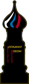
No longer operating, the Moscow catered to a mixed crowd of Russian expatriates and curious Americans. The line art of St. Basil's cathedral is from a personal photograph from my days in Moscow.
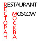
The logo is in both Russian and English. The nexus of the two is in the Cyrillic and Latin "R". Red is not simply the color of Soviet communism; rather, the landscape of Russia is so bleak that any color is worshipped, red being the most favored. (The root of the Russian word for "beautiful" and for "red" is the same.)
Also, red-and-black type has been a Russian standard since the early part of the 20th century.
Clicking each image below shows a more detailed image with background and production notes.
|
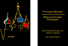 |
Napkin with line art and flag colors — click the image for a better view |
 |
|
 |
| Top |
![]()
Some
files on the site are available for detailed viewing in Adobe Portable Document
Format. If you don't have Acrobat Reader installed on your computer, please
take a minute and do so by clicking this icon. It's free and mostly painless.
All images and text on this site are registered with the US Copyright Office © 2006 by Peter C. Johnson unless otherwise noted. Other registered marks are the property of respective organizations.