


Your current location is: Home > Graphic Arts > Corporate Identity > Technology Firm
Technology Firm
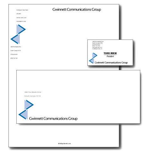
An internet startup (that started-up before the deluge, back in 1991) called the Gwinnett Communications Group needed basic identity materials.
The logo uses strict geometry to convey engineering, blue in two values to reflect reliability (important in communications) and the opposing arrow shapes symbolize network packet traffic. The space between the "arrows" is the classic symbol for electricity. Technology symbols can become clichés quickly (witness the 5.25-inch floppy disk!) so it was important to reduce and simplify. The corporate typography is shown below on letterhead, stationery, and a business card. Click an item to display a detailed image in a separate window.

![]()
Some
files on the site are available for detailed viewing in Adobe Portable Document
Format. If you don't have Acrobat Reader installed on your computer, please
take a minute and do so by clicking this icon. It's free and mostly painless.
All images and text on this site are registered with the US Copyright Office © 2006 by Peter C. Johnson unless otherwise noted. Other registered marks are the property of respective organizations.